Creative
Europe Desk
A full website overhaul for Creative Europe Desk Malta, the national contact point connecting Malta's cultural and creative sectors with European Union funding opportunities.
The existing site wasn't working hard enough for its audience. Creative Europe Desk Malta needed a digital presence that felt genuinely inviting to young creatives and emerging practitioners, not another institutional page buried in bureaucratic language and safe design choices.
The brief called for something user-friendly, energetic, and youth-facing, while still communicating the credibility and seriousness that EU stakeholders and grant applicants expect. Fun and professional weren't treated as opposites, they were the brief.
Existing brand guidelines were already in place. My role was to interpret them with creative freedom: to take what was there and push it into something that actually reflected the vitality of the creative sector the organisation champions.
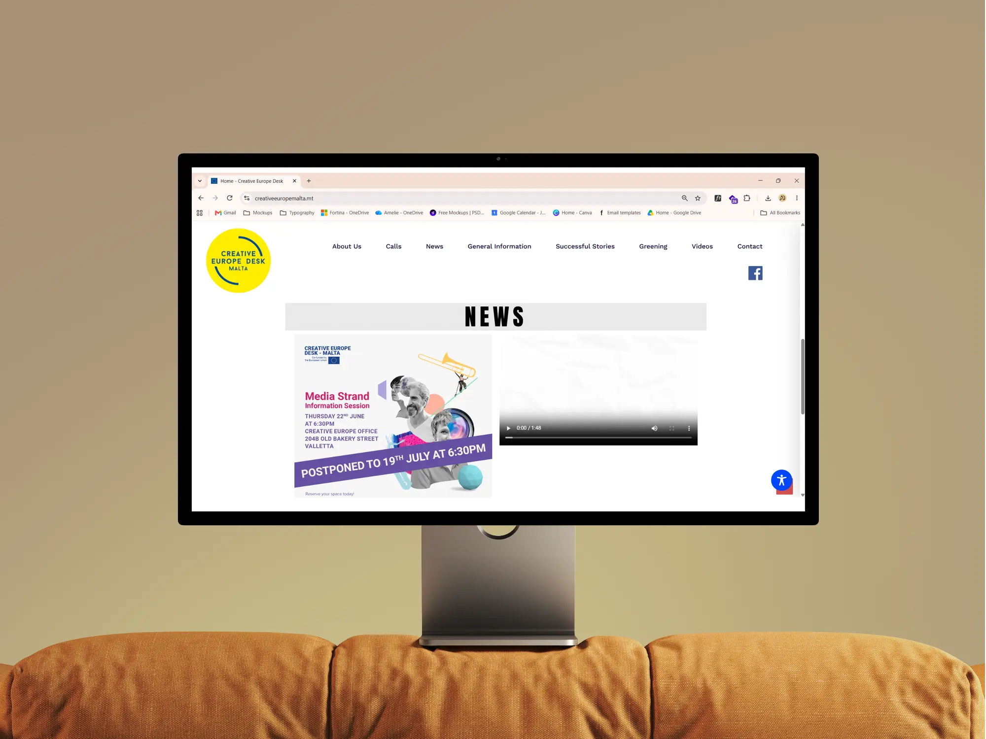
The original site: visually flat, difficult to navigate, and misaligned with the energy of the creative sector it represents. Nothing about it invited a young practitioner to stay and explore.
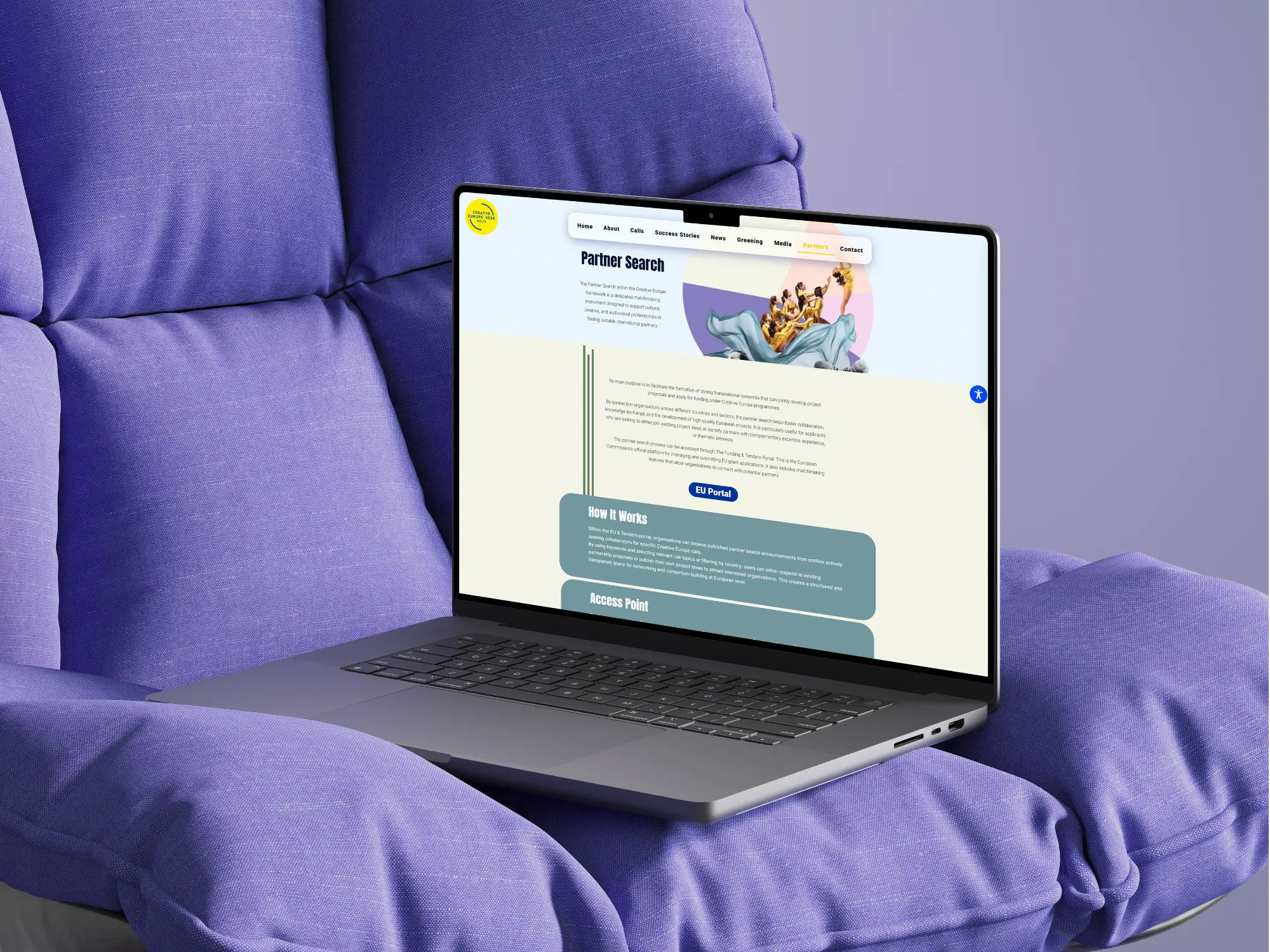
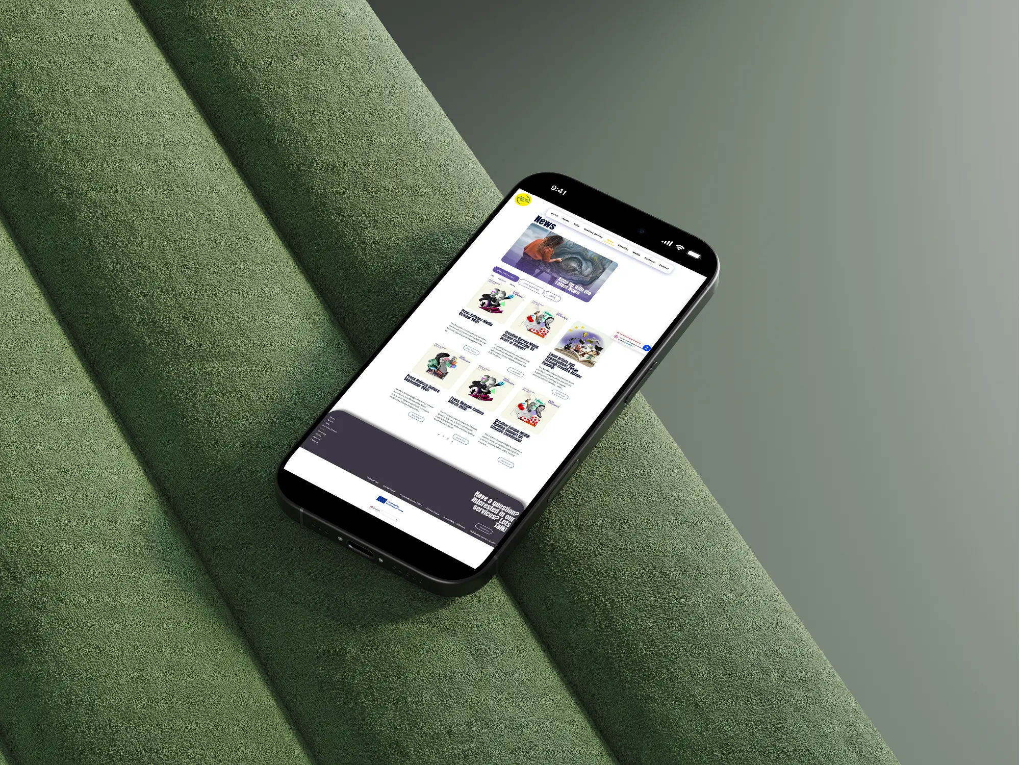
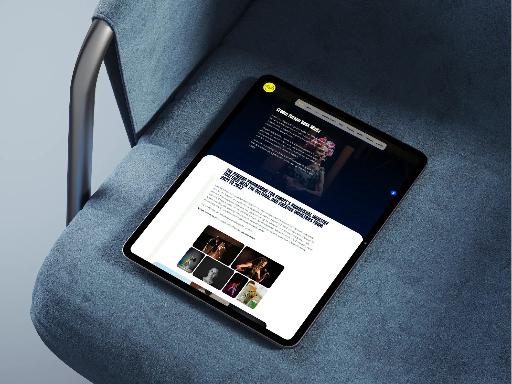
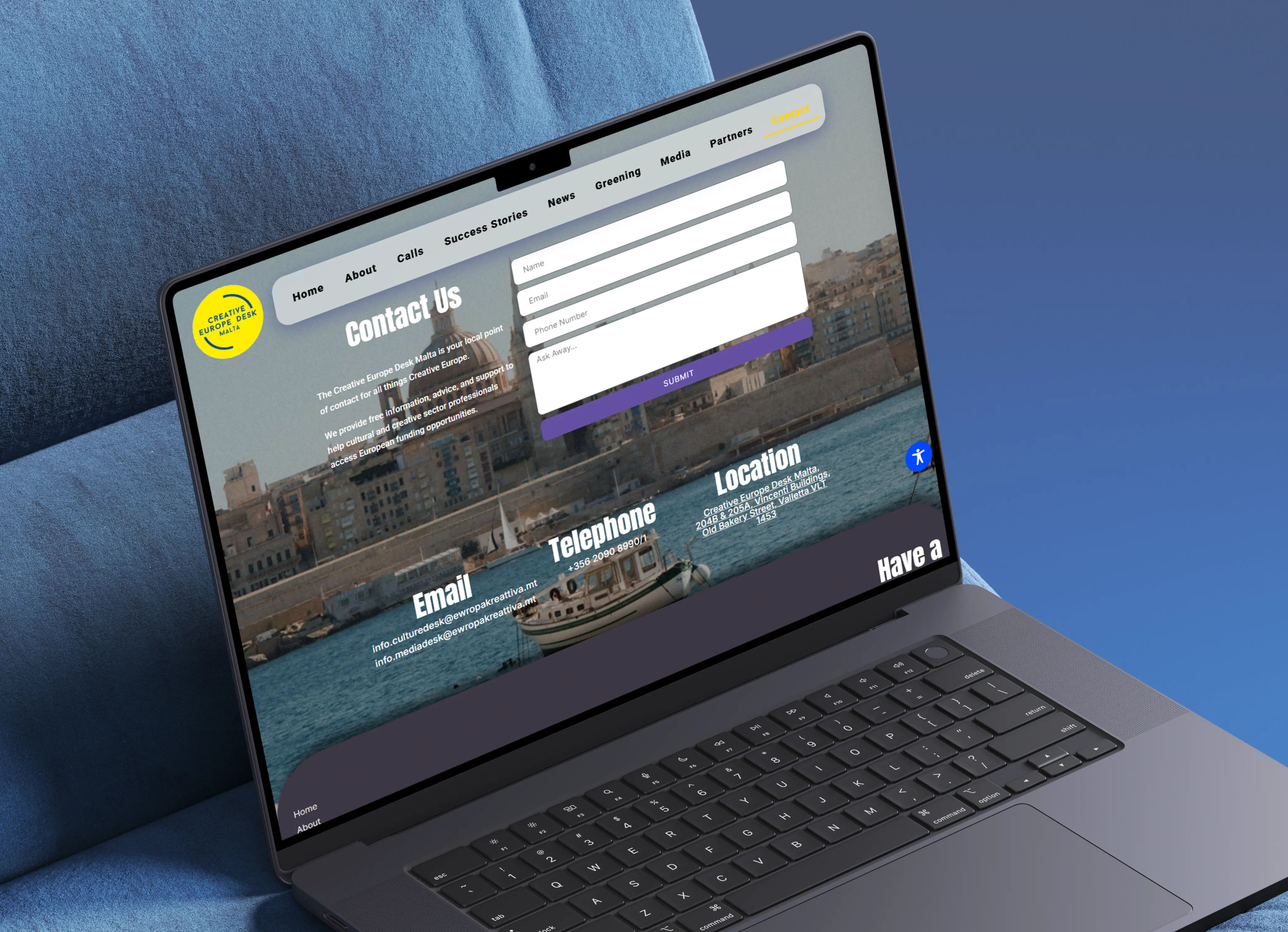
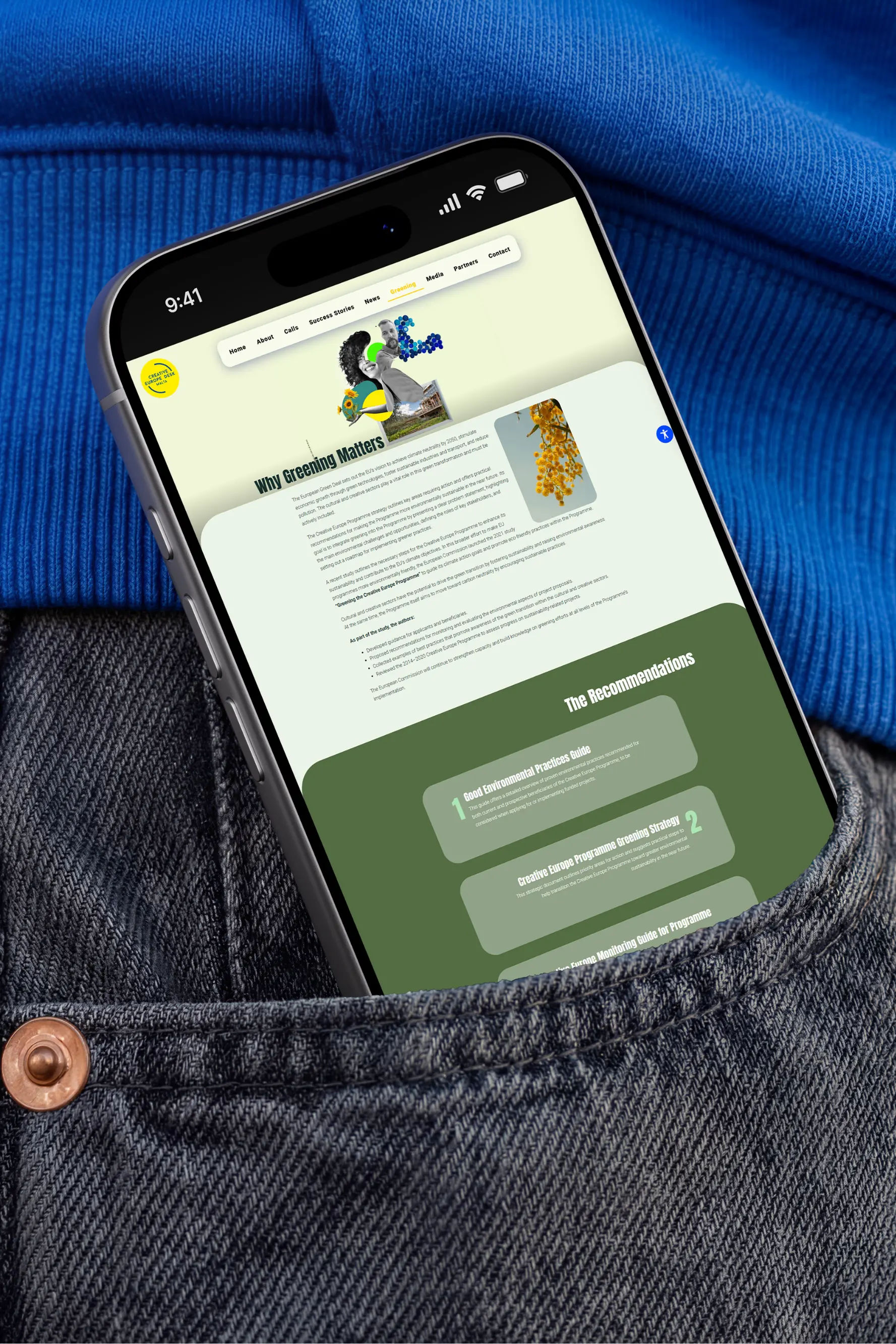
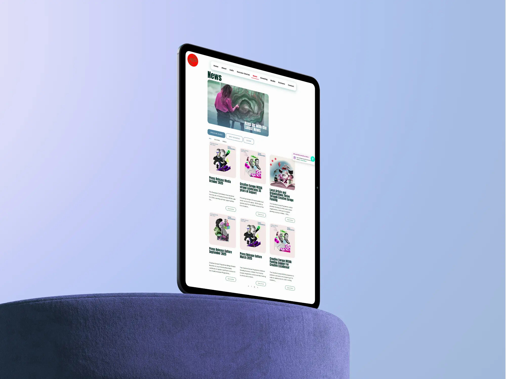
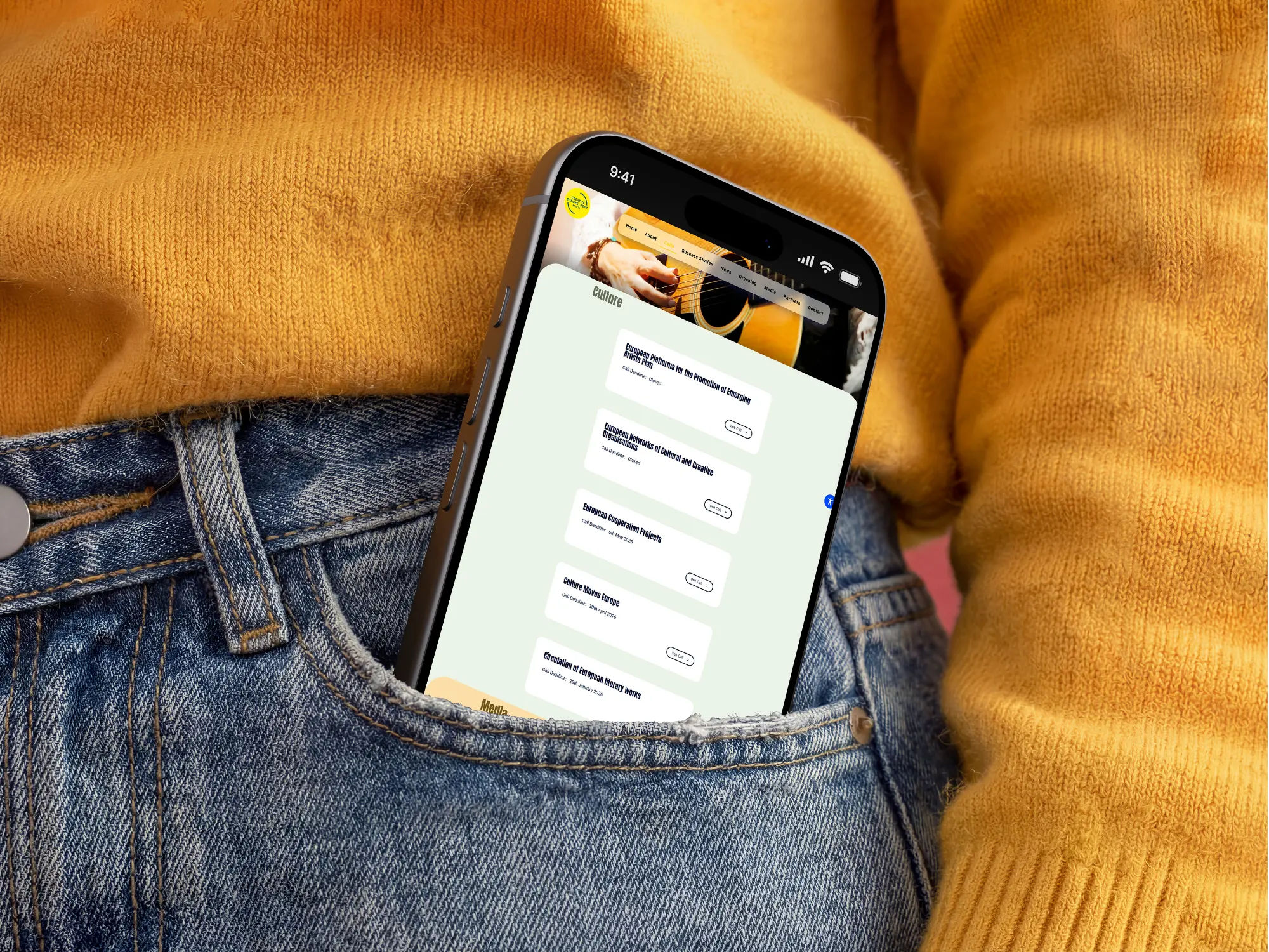
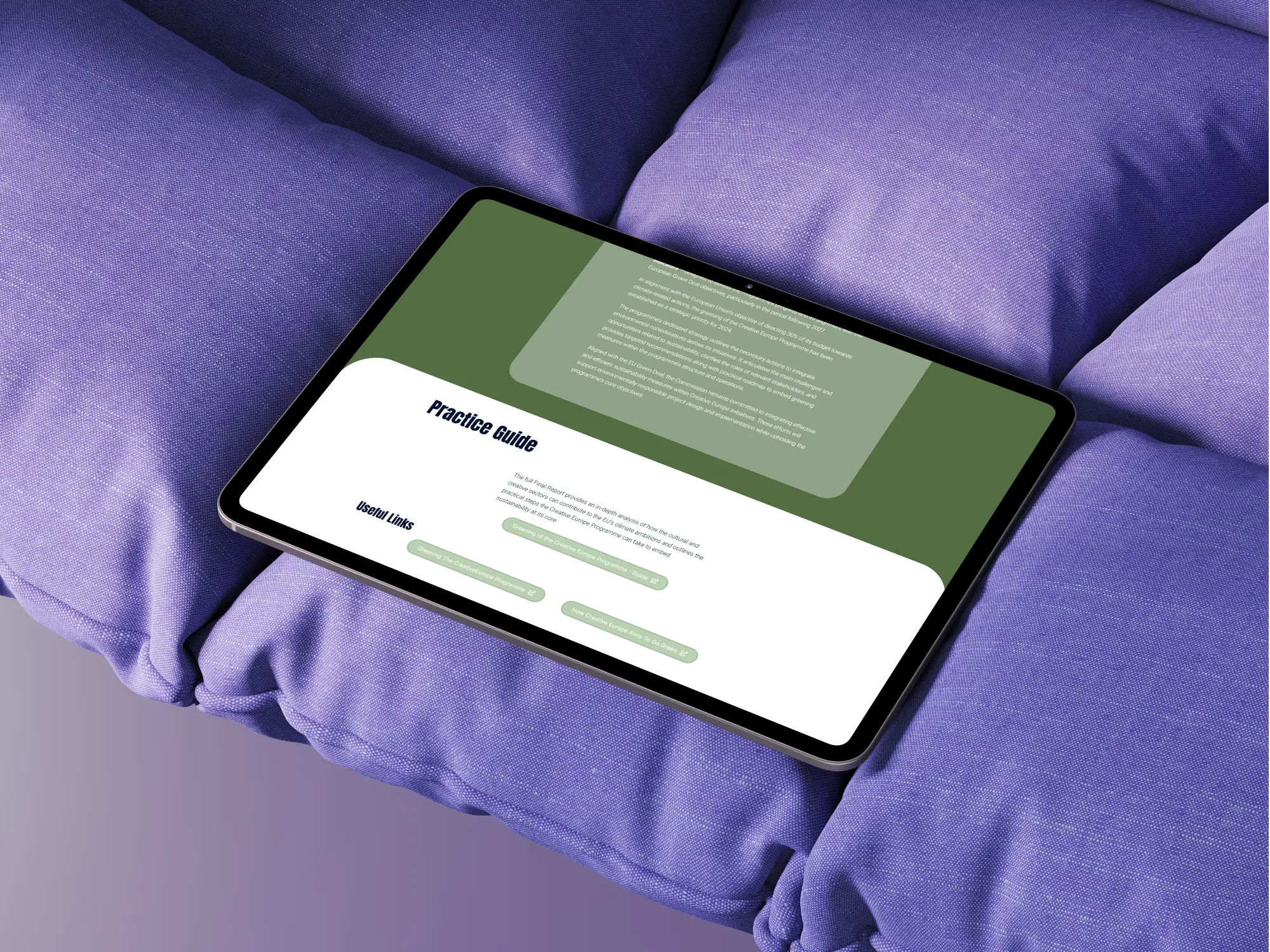
I designed every page of the site from scratch, layouts, components, animations, and all visual assets, working within the existing brand guidelines but given the latitude to interpret them. That freedom mattered. It meant the design could breathe rather than simply comply, and the result feels like a genuine expression of the brand rather than a template with the right colours dropped in.
The priority throughout was usability for a younger creative audience. Navigation is clear and direct, information hierarchy was rebuilt around how people actually look for funding opportunities, and the tone across the site is warm and accessible without losing institutional weight. Animations were designed to add energy and personality without getting in the way, purposeful movement rather than decoration.
The visual direction leans into the playful side of the brief: bold layout choices, considered use of the brand's existing palette, and a sense of rhythm across pages that keeps the experience feeling dynamic. The site is professional enough for EU stakeholders and engaging enough that a young creative practitioner won't click away after three seconds.
The build was a close collaboration with a developer, which meant design decisions were always grounded in what would actually work in production. Every interaction, transition, and responsive behaviour was considered at the design stage, so the handoff was clean and the final site matches the intent of the original designs.
Credits
Design - Amelie Dimech
Development - Amelie Dimech
Illustration - Amelie Dimech
Typefaces
Cormorant Garamond
DM Sans
Colours
#1F3A2D Forest
#DBCB96 Cardamom
#F5EFE7 Cream
Tools
Figma
Adobe Illustrator
VS Code
Vercel
Links