Bloom
Beauty
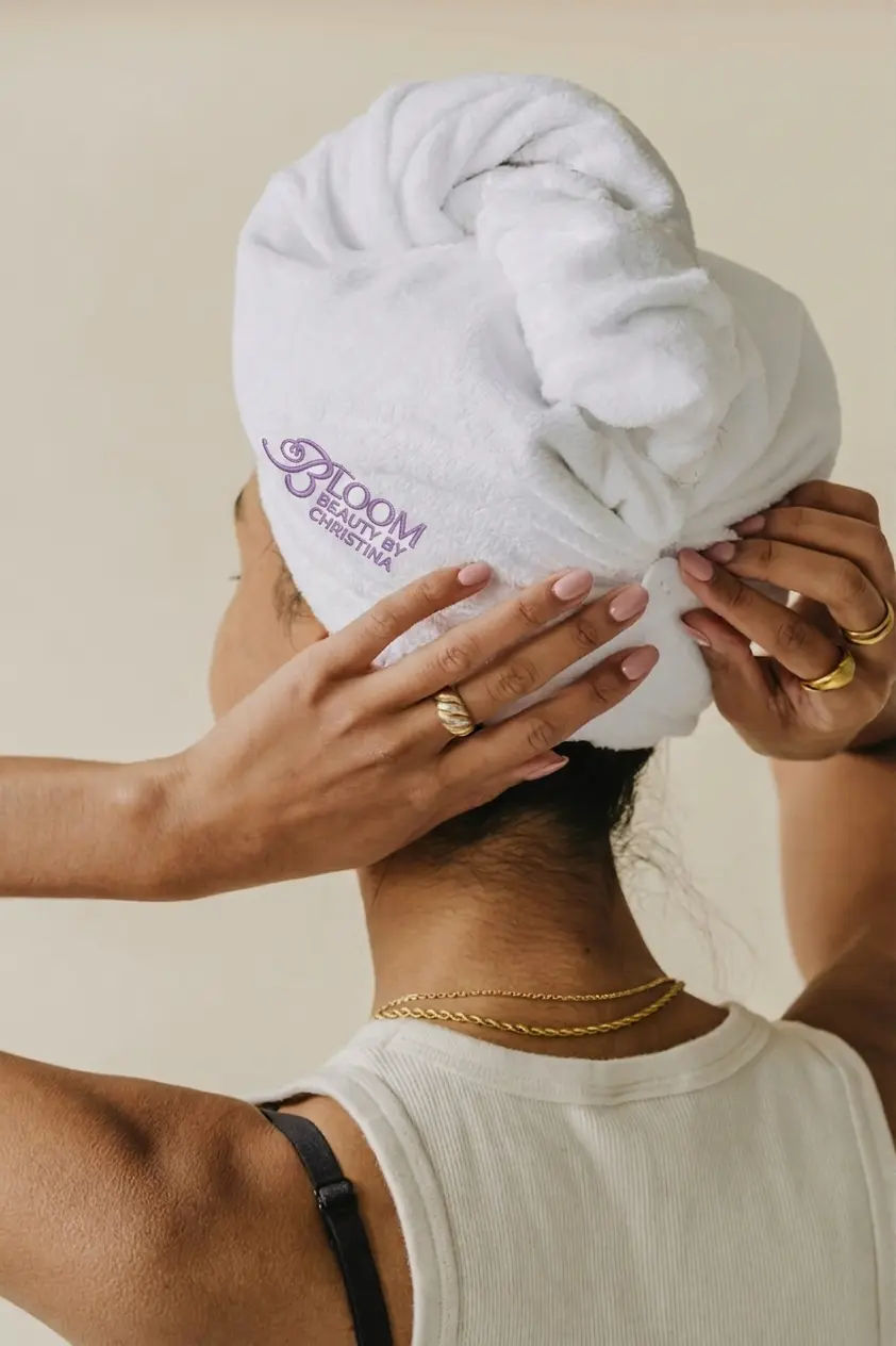
A full brand identity for Bloom Beauty - a skincare and wellness brand built on the idea that beauty is something you grow into, not something you wear.
The brief called for a visual identity that felt clean, considered, and confident - neither clinical nor overly decorative. Something that could hold its own on shelf, in digital spaces, and in print without needing to shout.
The beauty market is saturated with brands competing for shelf space through loud colour, ornate type, and aggressive claims. Bloom needed to do the opposite - to stand out by standing back, without relying on trend-driven decisions that would age within two years.
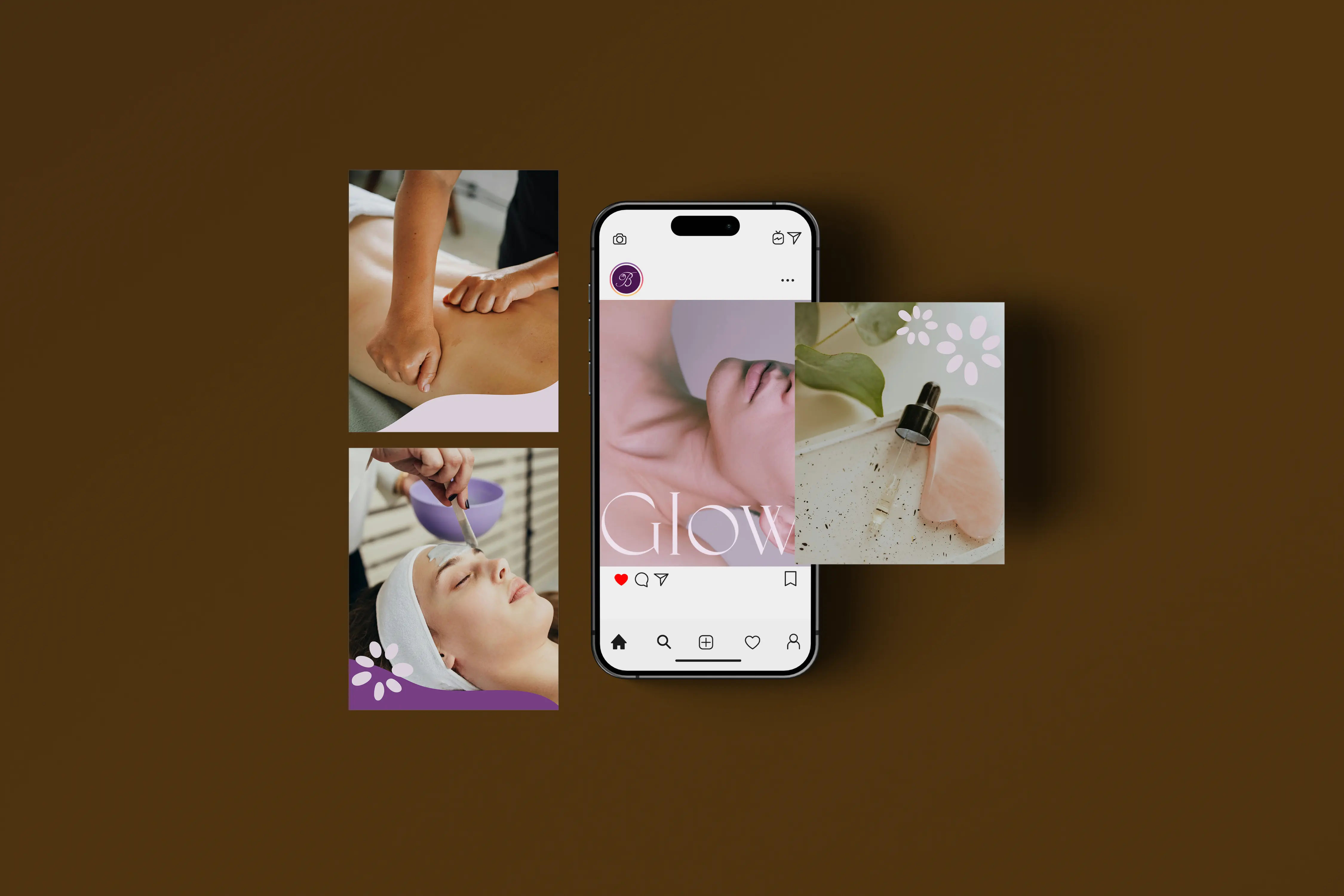
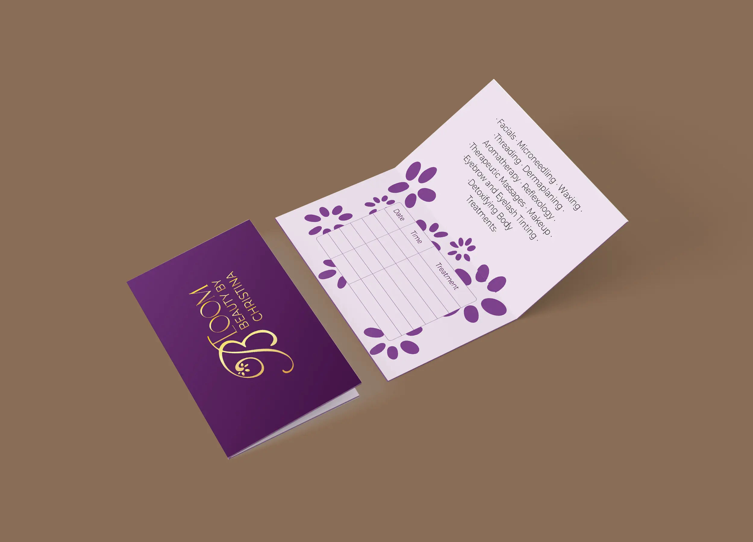
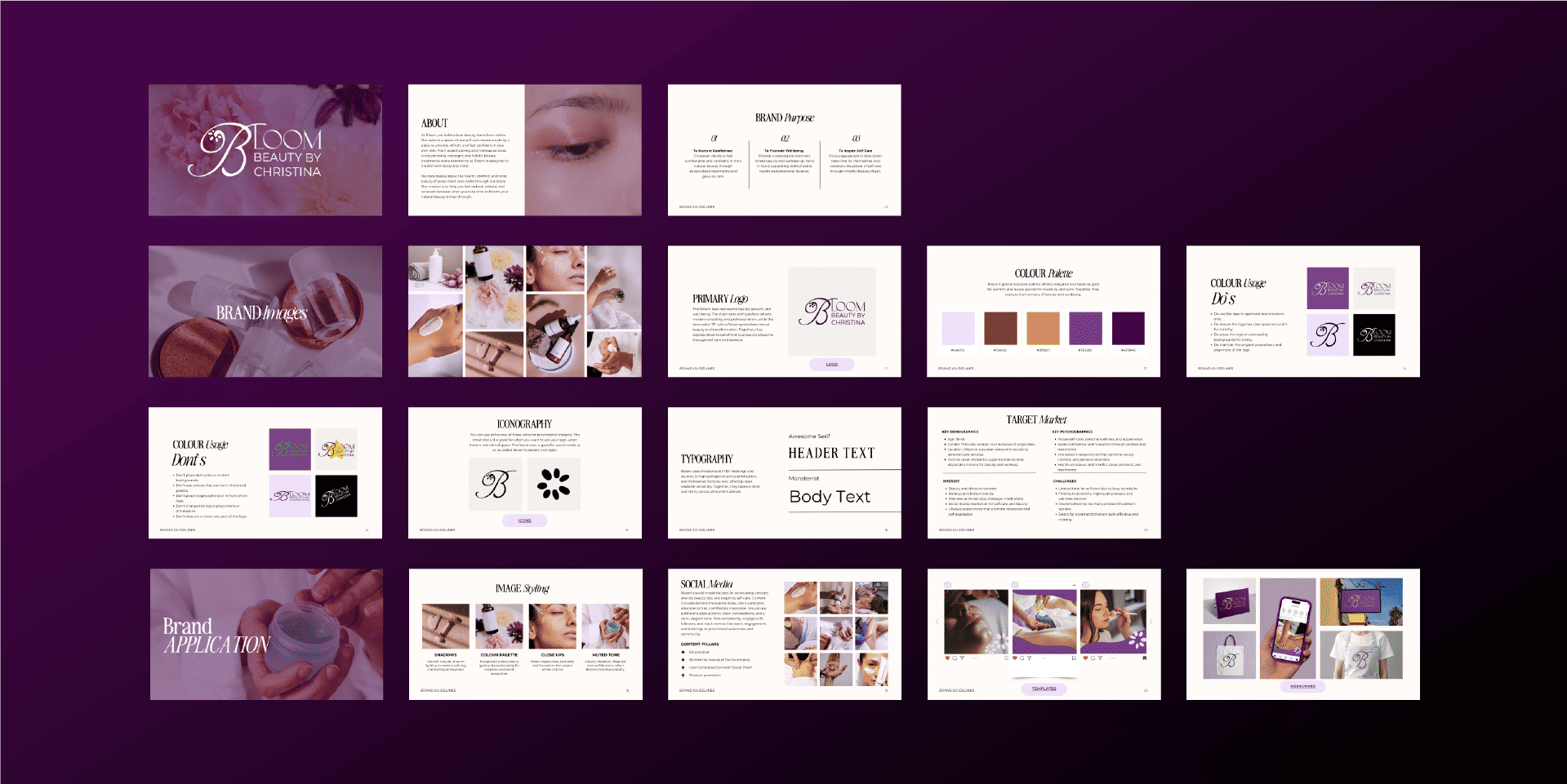
The rollout was ambitious: packaging across six SKUs, a brand guidelines document, social media templates, and stationery for press gifting - all needing to work together as one coherent system from day one.
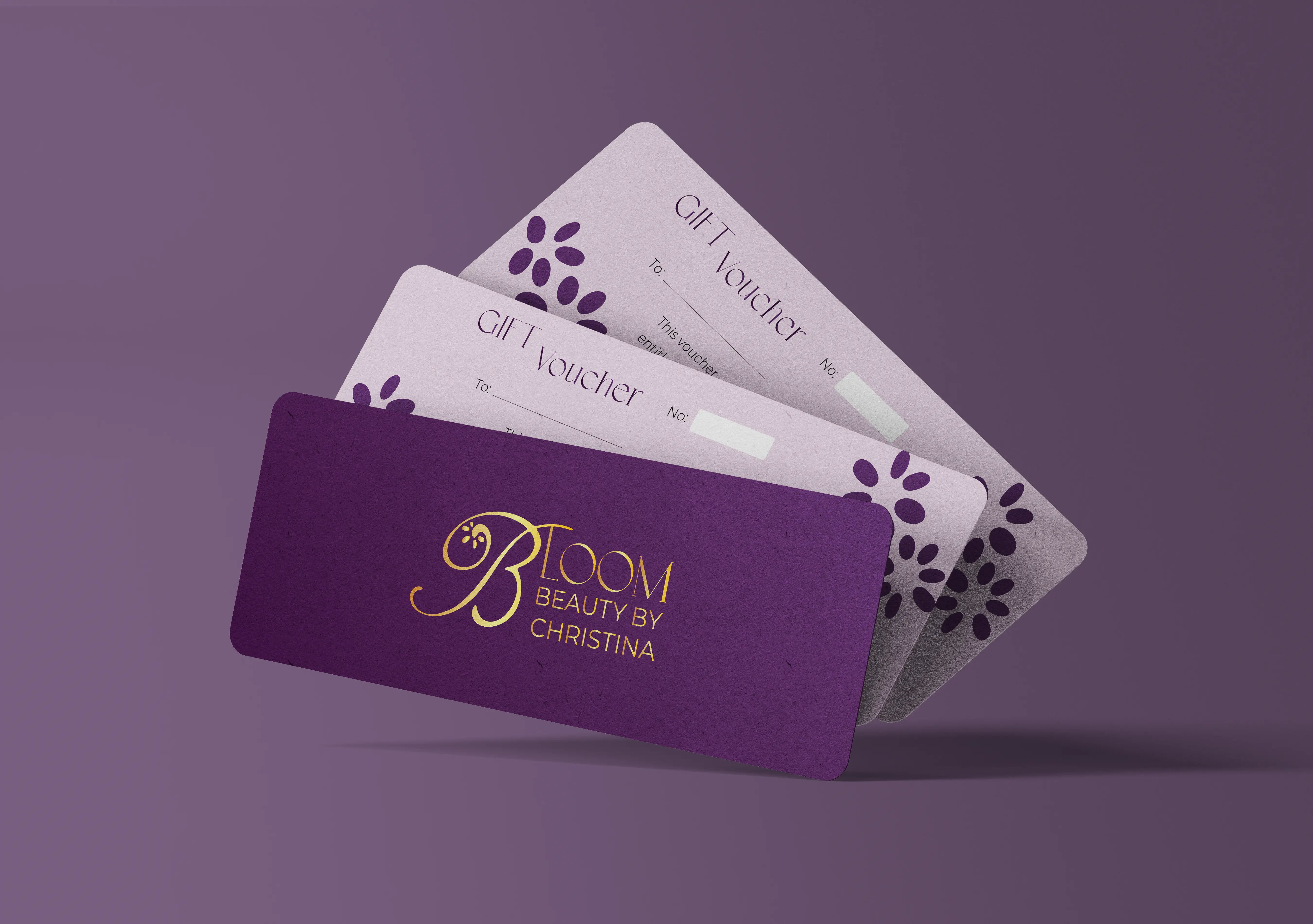
I started with a research phase - studying the competitive landscape, identifying white space, and building a moodboard around the brand values: growth, clarity, softness, and confidence. The creative direction emerged from that tension between warmth and precision.
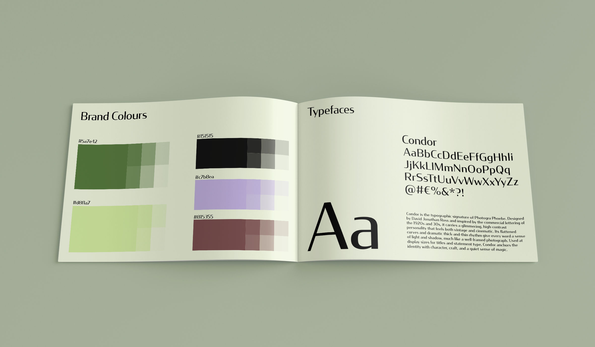
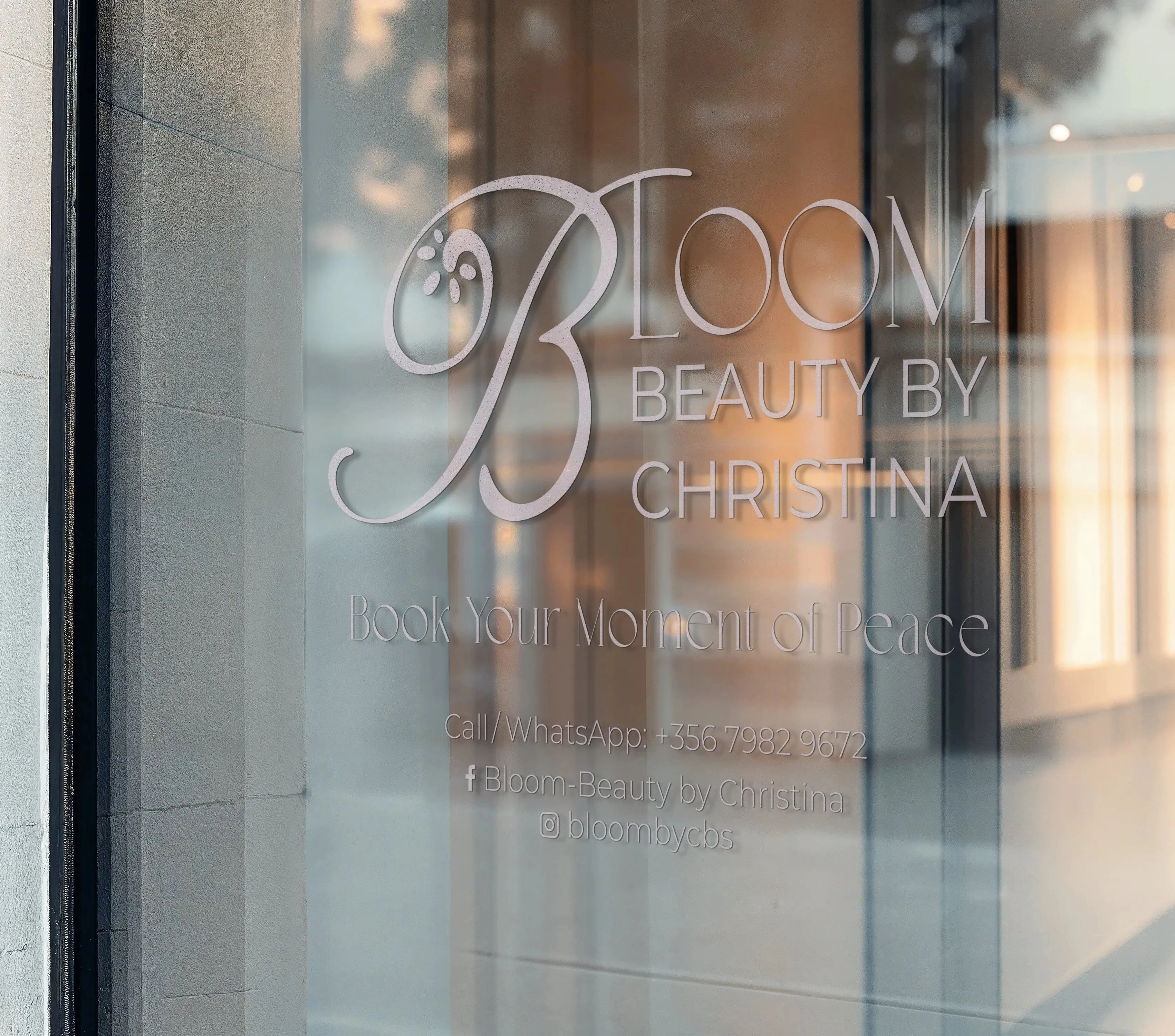
The wordmark was drawn from scratch: a custom letterform treatment that softens the geometry just enough to feel approachable without losing authority. The supporting palette uses a warm neutral base with a single accent - allowing the product photography to breathe while maintaining brand recognition across contexts.
Typography was chosen for longevity. The pairing of a refined serif display with a clean grotesque for body copy creates a system that feels editorial at large sizes and highly legible at small ones - essential for packaging compliance text as much as for campaign headlines.
Credits
Design - Amelie Dimech
Photography - Bloom Beauty
Typefaces
Fraunces
Montserrat
Colours
#F5EDE3 Cream
#D9B3A1 Petal
#3D2E26 Espresso
Tools
Adobe Illustrator
Adobe InDesign
Adobe Photoshop
Figma