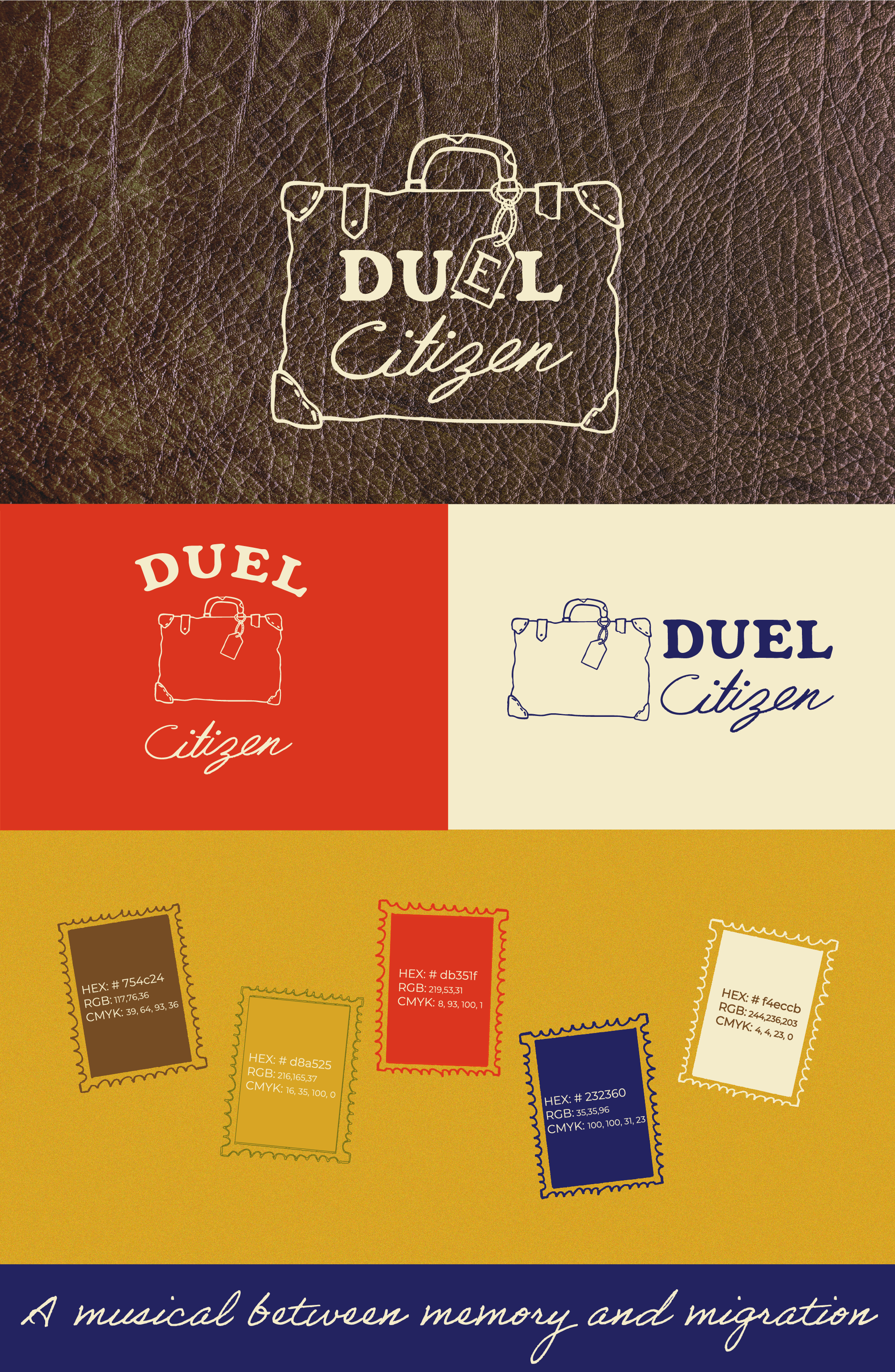
You reach out to a designer and ask for a logo that fits your vibe and what you want, and most designers will just stop there. But what happens after? How do you use your logo, what colours represent you, and how do you communicate to your audience? How can they know who you are if not even you know who you are? A great example to picture this. Imagine you're face to face with a client, and you speak to them in English, then next time in Chinese, then Russian. Confusing, right? That is what a brand without guidelines is.
You had a logo, but not a brand system. There's a big difference.
A logo is a mark. A brand is a language.
Brand guidelines tell everyone who touches your brand exactly how to use it. Without them, every person makes their own call. Your social media manager picks a font that "looks similar," your printer tweaks the colour, your cousin sends a compressed PNG from WhatsApp. Nobody is doing anything wrong. They just don't have the rules to abide by.
What brand guidelines cover
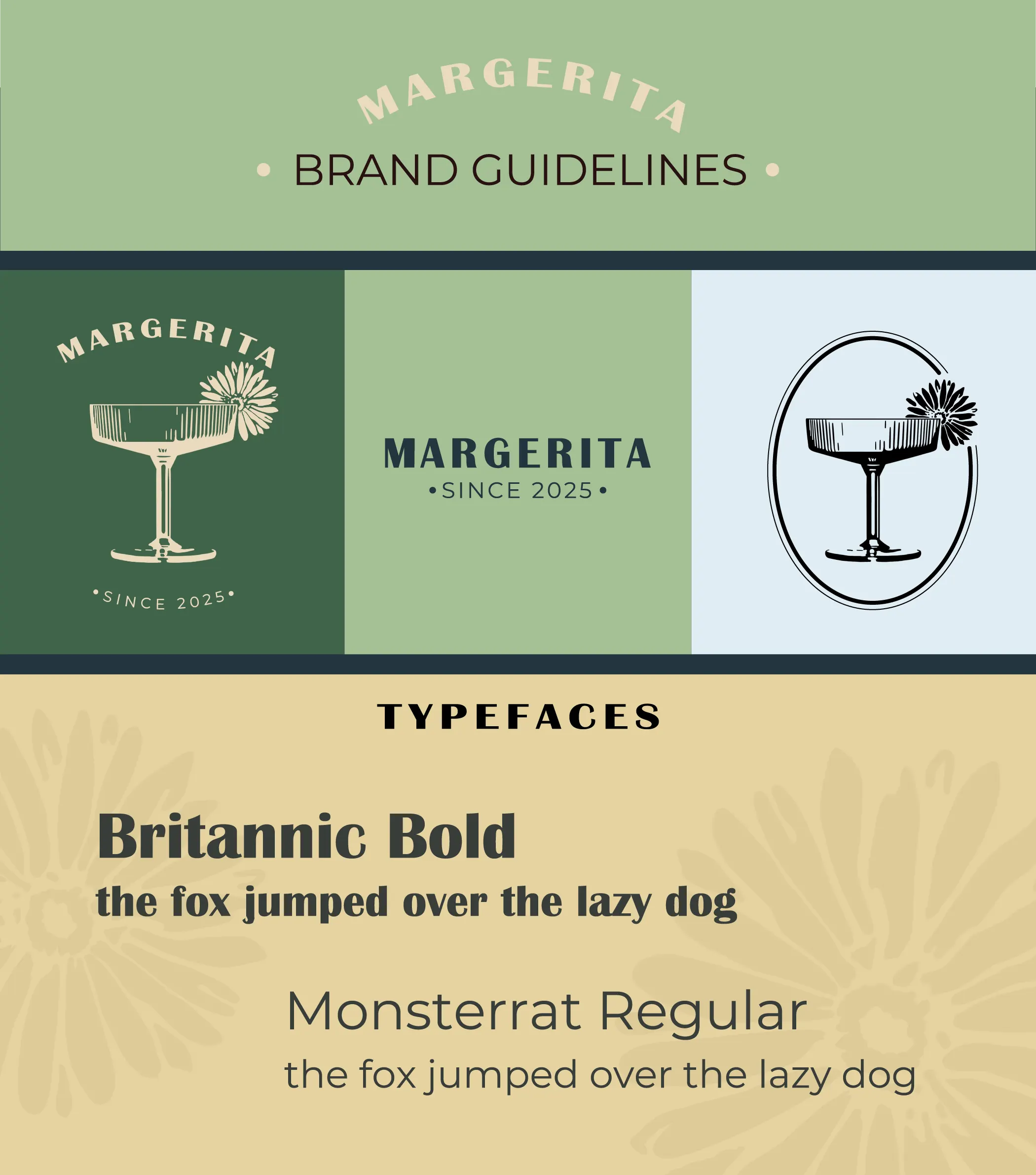
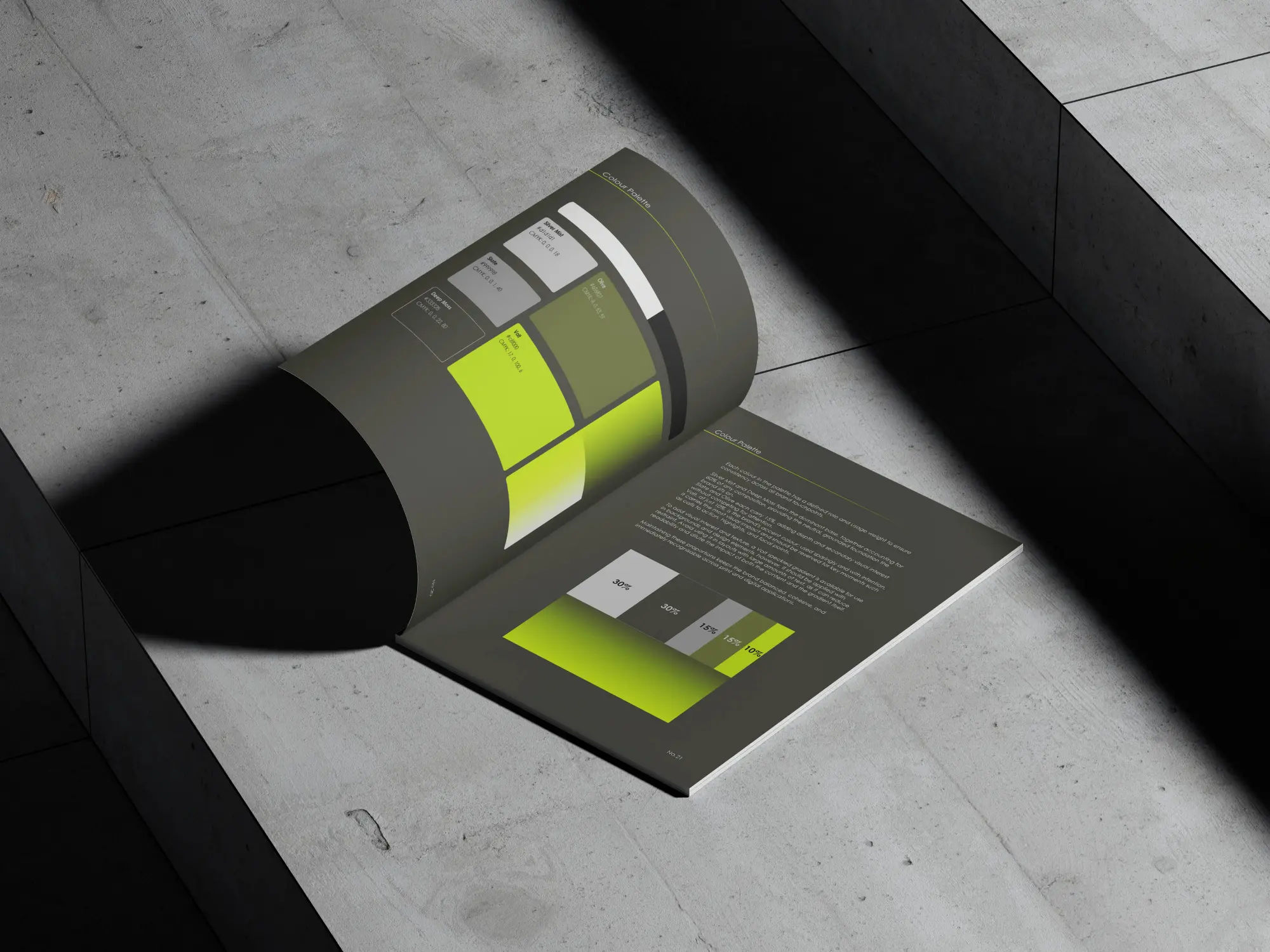
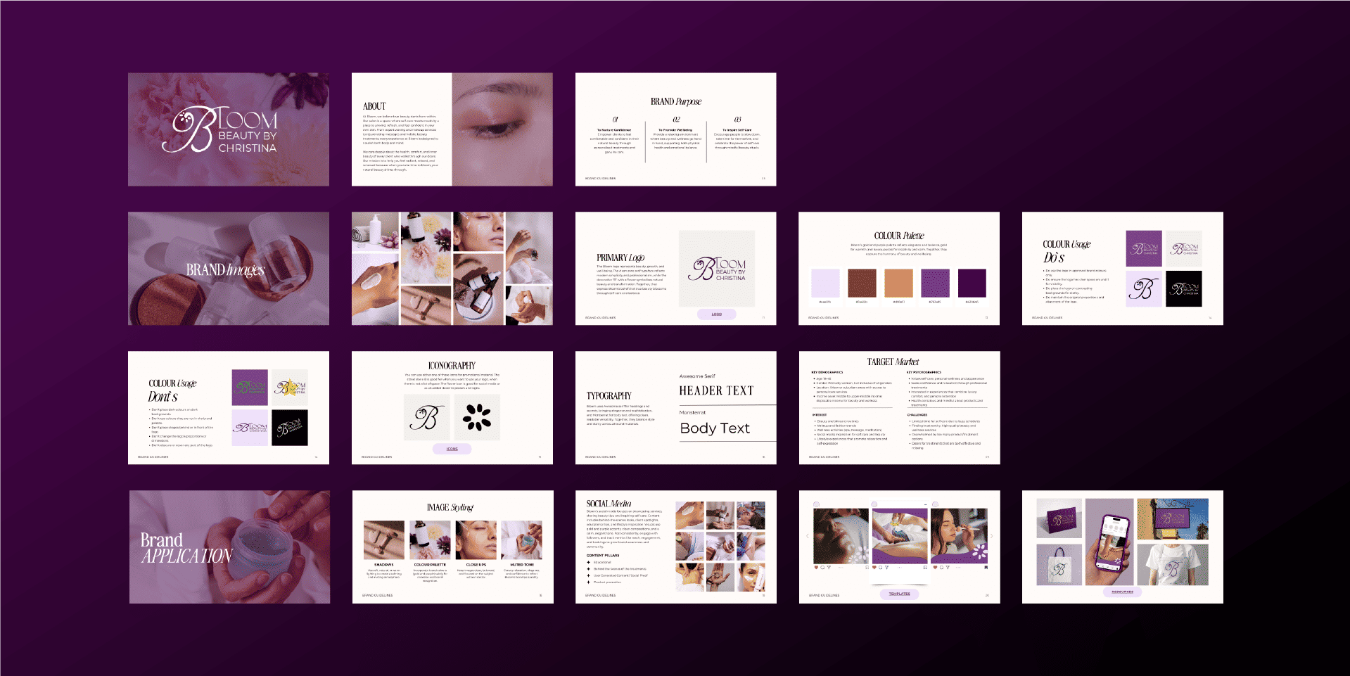
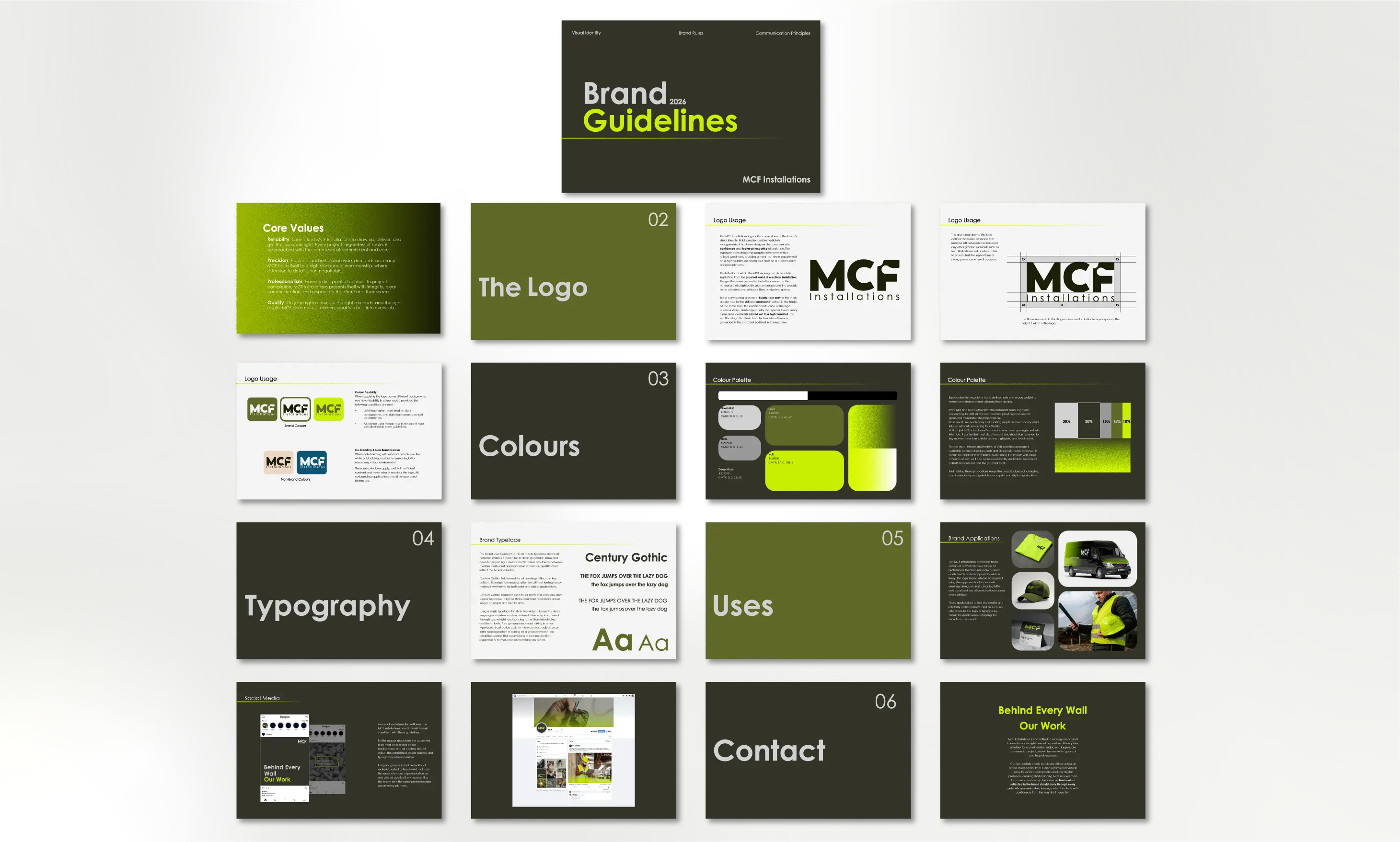
At the very least, brand guidelines include logo usage rules, exact colour codes in HEX, RGB, and CMYK, typography, logo variants, and tone of voice. That's enough to keep your brand consistent across every touchpoint. If you're serious about your brand and its future, this is a vital step.
The same brand, different contexts. Each variant has a job to do.
Why logo variants aren't optional
One well-designed logo is a great start, but does it fit in your social media profile picture? Does it look good on all backgrounds? If it were printed on a business card, would it still be recognisable? One logo cannot fit all these requirements. That's where logo variants come in. Your mark needs to work on white, on dark backgrounds, at billboard scale and favicon size, in full colour and single colour.
Without them, whoever needs your logo will improvise, and that's what chips away at consistency over time.
The cost of skipping this
Inconsistency is not subtle. People see it immediately, even if you don't. Every time your brand looks slightly different, it creates a small moment of doubt. For a startup, that doubt is expensive; you're asking people to take a chance on something new. A brand that looks consistent everywhere signals that you're professional and serious. It also makes every future piece of marketing easier, because the decisions are already made.
What to ask your designer for
- A full logo suite, covering primary, reversed, stacked, horizontal, monochrome, and icon-only versions, in SVG, PNG, and PDF.
- Brand guidelines covering logo usage, colour codes, and typography.
- Colour values in HEX, RGB, and CMYK.
- The source files in AI or EPS format so you own your assets outright.
- Social media templates so your brand shows up consistently online from the start.
A good designer includes this as standard. If you're just getting started, my Starter Package was built around exactly this list. It includes logo design, two variants, short brand guidelines, four Instagram templates, and four mockups so you can see your brand in context before you launch.
The bottom line
A logo is a starting point, not a finish line. When you invest in one, invest in the system around it too. It's the difference between a logo that looks great on launch day, and a brand that still looks great five years later.

.png?updatedAt=1786288003490)