One of the first things clients ask me when we start working on a brand is what colour they should use. And nine times out of ten, their first instinct is to reach for their favourite colour. Which is completely understandable. But your brand isn't about you. It's about the person you're trying to reach, and colour is one of the most powerful tools you have to communicate with them before you've said a single word.
So how do you actually choose? Here's how I think through it with every client.
Colour communicates before anything else.
Before someone reads your name, your tagline, or your product description, they've already formed an impression based on colour. It happens in seconds and it's largely subconscious. A warm terracotta says something completely different to a cool navy blue. A deep forest green positions you differently to a bright lime. None of these are wrong choices, but they all send a signal. The question is whether the signal you're sending matches what your business actually is.
Start with your audience, not yourself.
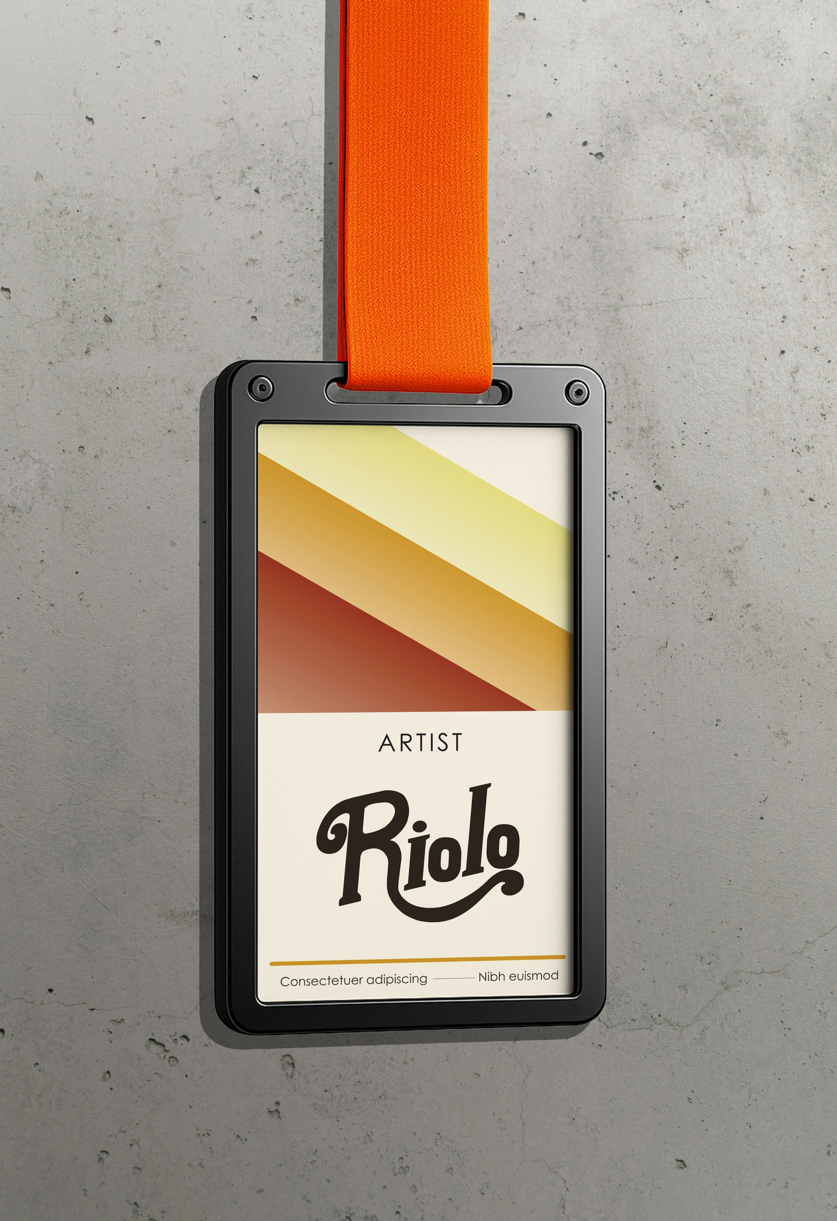
The most useful question to ask at the start is not "what do I like?" It's "who am I speaking to, and what do I want them to feel?" A brand targeting young mothers looking for calming, natural baby products will likely use a very different palette to a brand targeting young men looking for premium streetwear. Both can be beautifully designed. Both need to speak directly to a specific person in a specific state of mind.
Think about where your audience already spends time, what other brands they trust, and what visual world they already live in. You don't need to copy those brands, but understanding that world tells you a lot about what will feel right and what will feel off.
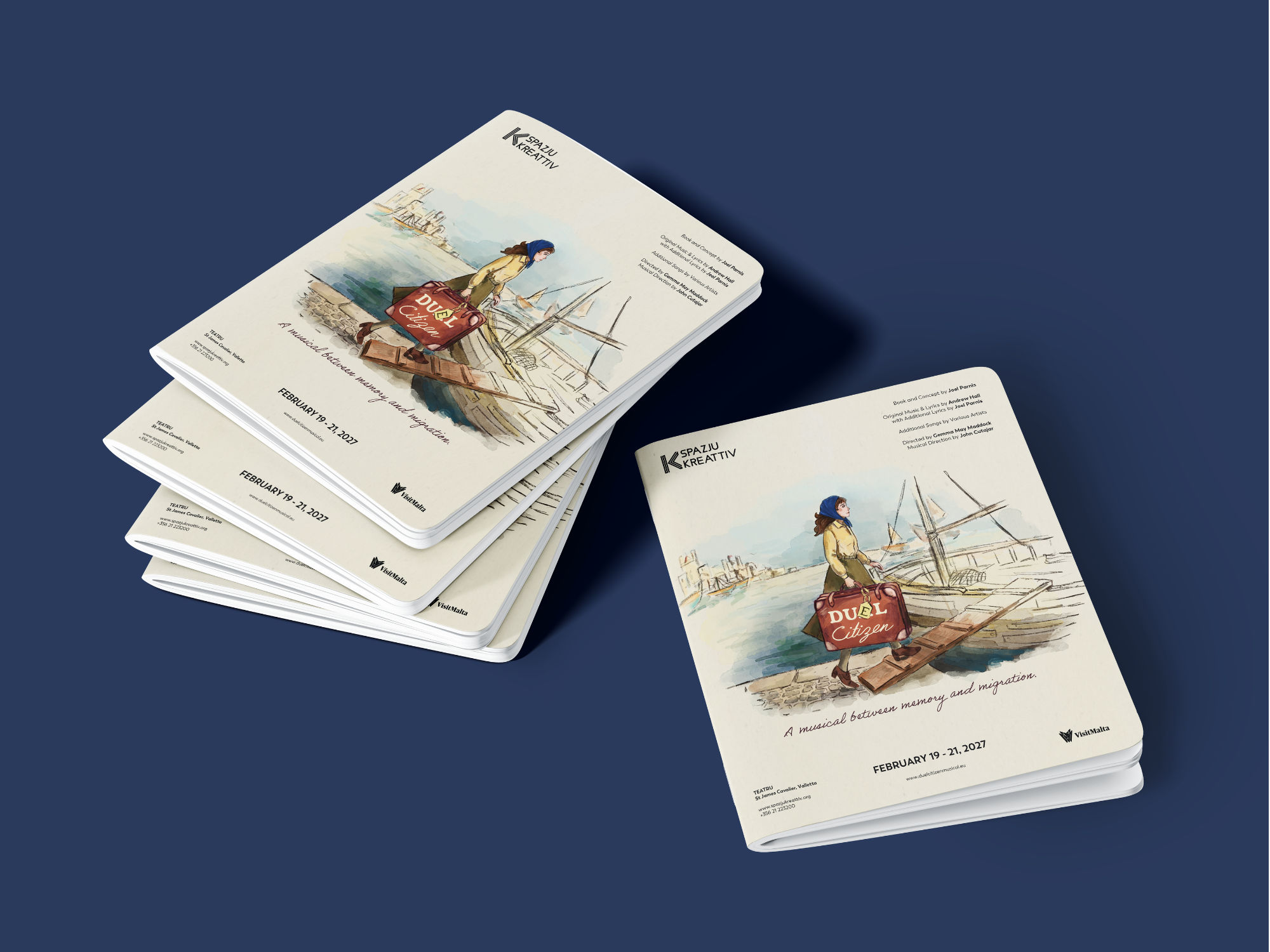
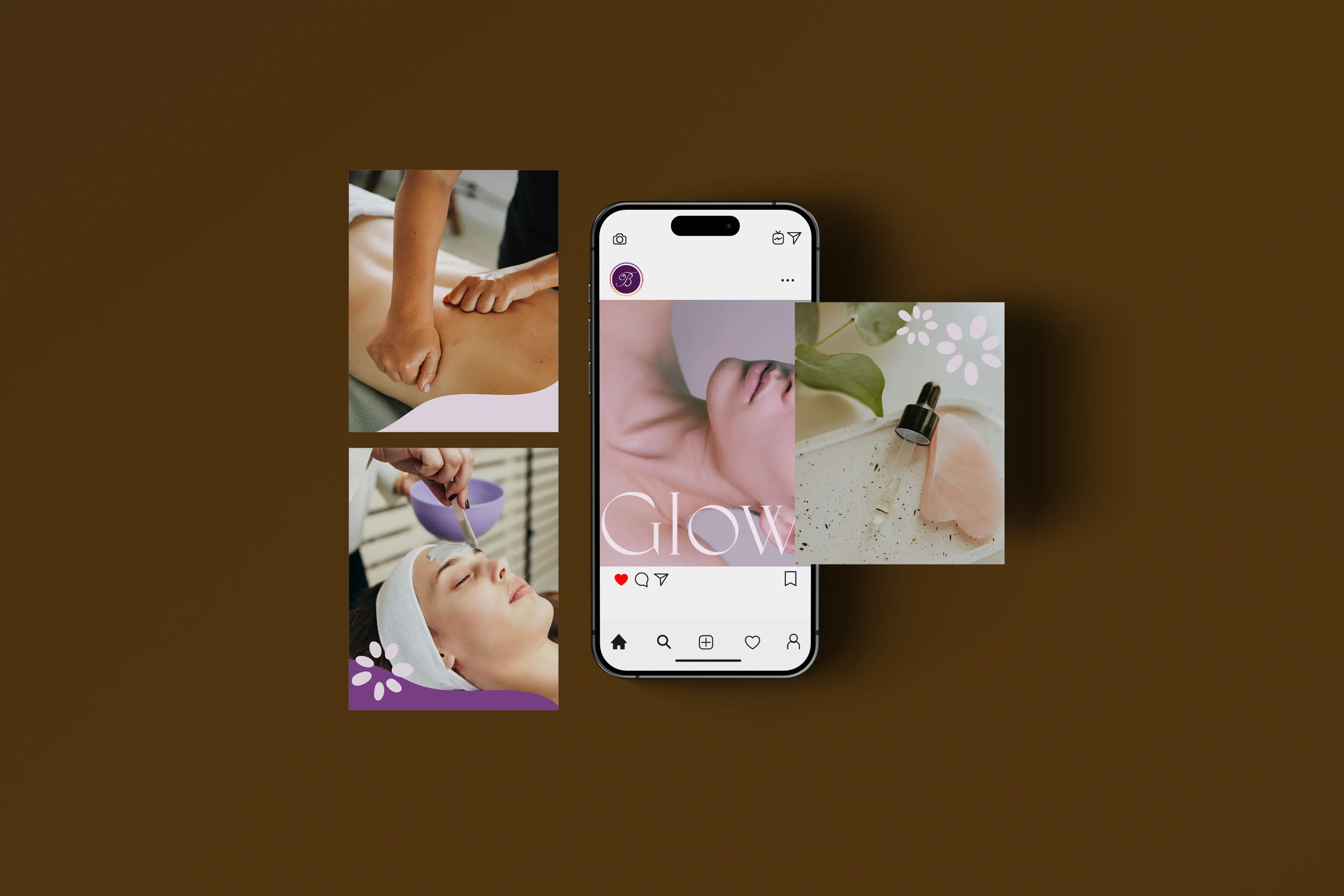
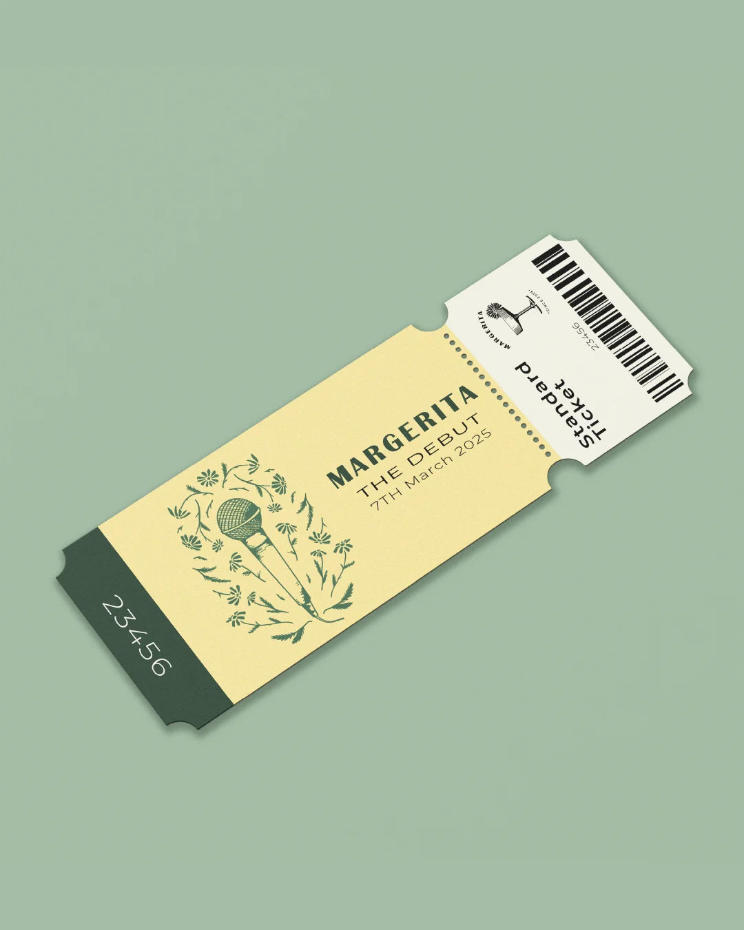
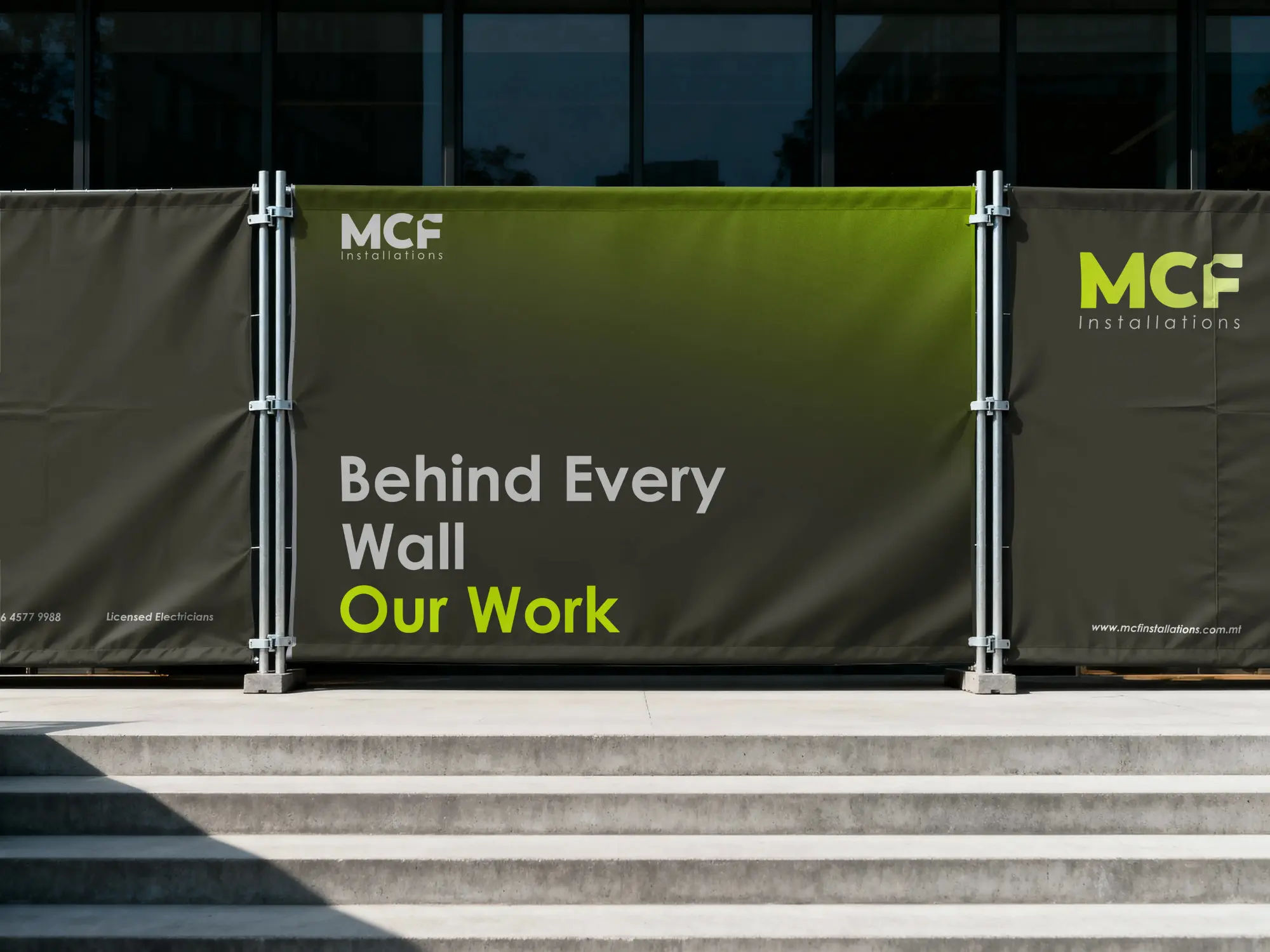
Two very different audiences, two very different palettes. Both deliberate choices made for specific people.
Think about your industry, then decide how to sit within it.
Every industry has visual conventions. Finance tends toward navy, grey, and green because they signal stability and trust. Wellness reaches for sage, beige, and muted warm tones because they signal calm and care. Tech often goes dark and minimal. These conventions exist because they work, but they also mean that if you follow them exactly, you look like everyone else in your space.
So the real decision is this: do you want to blend in or stand out? There's no universally right answer. A new law firm might want to signal trustworthiness by staying close to convention. A new skincare brand in a crowded market might want to stand out by doing something bolder. Know which one you're choosing, and choose it on purpose.
Colour is not decoration. It's the first sentence your brand speaks, before anyone reads a single word.
How many colours do you actually need?
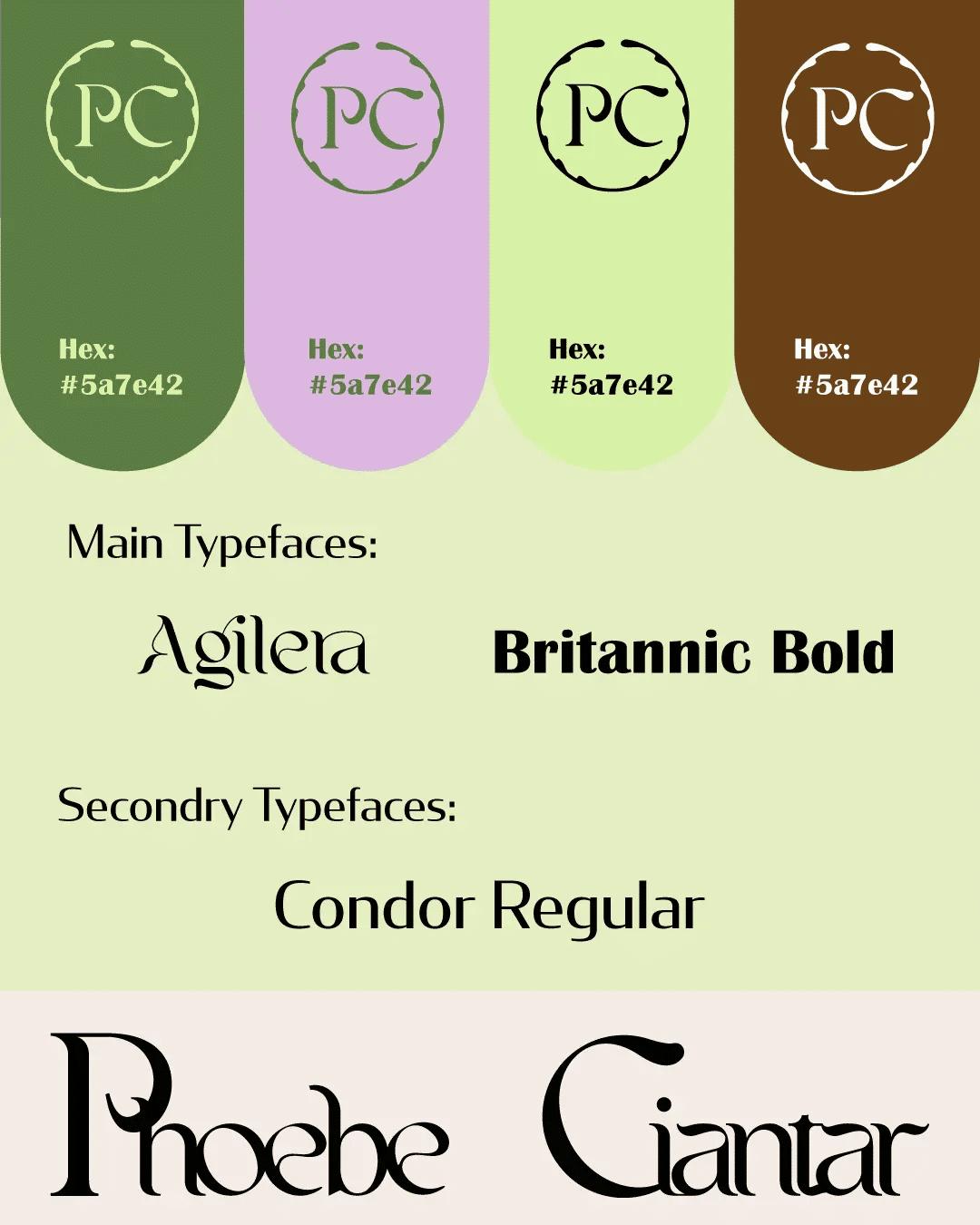
Most brand palettes work best with three to five colours. You typically need a primary colour that does most of the heavy lifting, a secondary colour that adds depth or contrast, one or two neutrals for backgrounds and text, and occasionally an accent colour for calls to action or highlights. More than five colours and things start to feel scattered. Fewer than three and you can run out of room to work with across different touchpoints.
Each colour in your palette should have a job. If you can't say what a colour is for, it probably doesn't belong there.
Test it before you commit.
A palette that looks great as swatches doesn't always translate well in use. Before you finalise anything, check how your colours work together in context. Do the combinations pass basic accessibility contrast checks for text on backgrounds? Does the palette still feel cohesive when one colour is dominant and the others are used sparingly? Does it work in both digital and print contexts, where colours render differently?
A good designer will walk you through this before anything is finalised. The goal isn't just a beautiful set of colours on a mood board. It's a palette that holds up across every place your brand will actually appear.
What this means in practice.
When I work through colour with a client, we start with their audience and their positioning, then we look at the industry landscape, then we build a palette with specific roles assigned to each colour, and finally we test it in context before signing off. It takes longer than just picking something that looks nice, but it's the difference between a palette that feels like it belongs to your brand and one that could belong to anyone.
If you're building a brand from scratch, this is one of the decisions that's worth getting right the first time. It feeds into everything else, from your logo to your website to your packaging. And changing it later is expensive, both in time and in the brand equity you've already built.
The bottom line.
Your brand colour palette is not about what you love. It's a strategic decision that shapes how people feel about your business before they know anything else about it. Start with your audience. Understand your industry. Build a palette where every colour has a purpose. And test it in the real world before it goes anywhere near a printer or a website.
If you're just getting started and want someone to help you work through all of this properly, my Starter Package includes a full colour palette with exact values in HEX, RGB, and CMYK, alongside your logo, brand guidelines, Instagram templates, and mockups. Everything you need to launch looking like you mean it.